Design Shift
/Over the last few months I have made some design changes to the Chalet Livingroom - today I want to talk about the process.
console table
Let’s start at the beginning… back in July I was lamenting… I didn’t like my livingroom… wah wah…
Should I swap the console table for the cabinet in the upstairs hall? I didn’t like my couch and for that matter I didn’t like the coffee table either… wah!
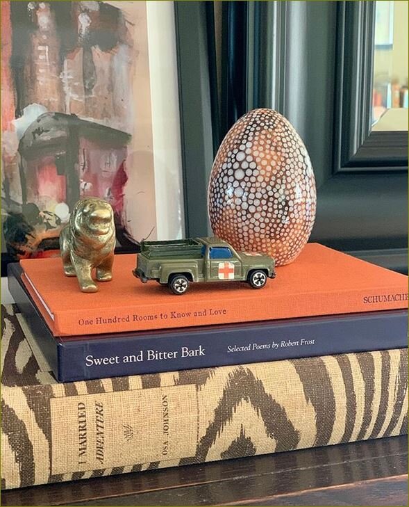
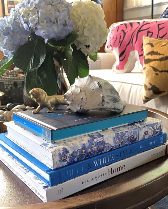
I stopped dead and decided to pull everything off the console table and restyle - which I did… and viola! Once lightened up with less - I was in love again! Removing frames and books made a huge difference!
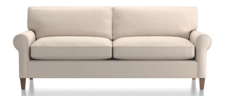
Then I decided I needed to a new couch - if you read my piece from 11/14/2018 Couch - furniture for sitting or reclining. I went to Crate and Barrel and placed an order for the Montclair Sofa - Traxx fabric in Feather - it would be delivered in October. I kept looking around the room going piece by piece… what else could I change?
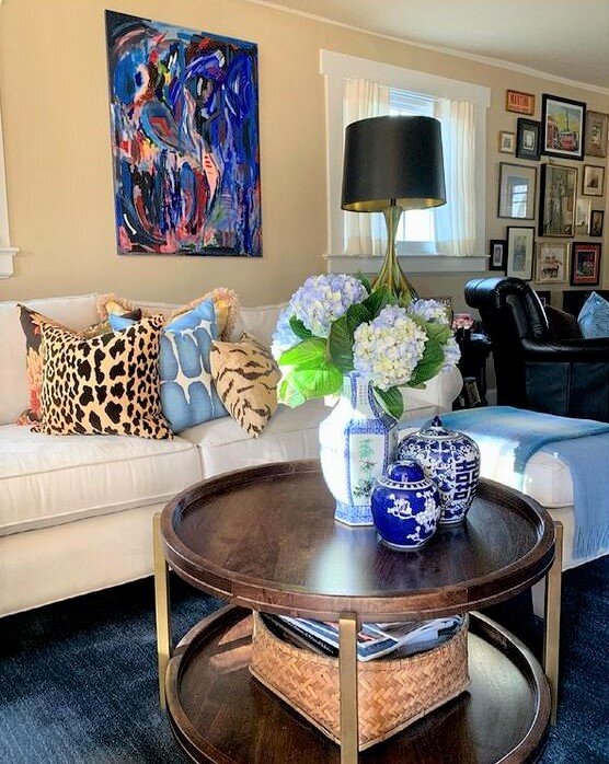
Next up was a coffee table…. while I still love my bench… the rustic finishes were no longer where I wanted the livingroom to be… So I made my way to one of my very favorite retailers Home Sense. In my minds eye I knew what I wanted… and tho and behold it is exactly what I found… round and two tier! I am in love my friends and the brass accents on the legs are the crowning jewel!
The next bit I tackled was the top of the television cabinet…. I put away a lot of decor.
I love how the top of the China Cabinet is styled. For some reason I had always resisted symmetry - I love my new Home Sense lamps! I was inspired by interior designer and friend Diane Rath - she actually picked up these very same lamps up for a client. Diane is someone I’ve seen use pairs of lamps successfully in her designs. I’m loving the deer art here too - I had never leaned art on a cabinet before… on the floor on the mantel on window sills Yes but never when wall space was available. I grabbed this image prior to moving the Art that was hidden behind the lamp.
I reworked the sideboard as I was de-christmasing the chalet. I wanted to get a lighter brighter look in this area, but, before I went out and shopped for something new - I shopped my house. Moving this cloisonne lamp from the upstairs hall really made the area pop - especially since the lamp shade is white. I also took down a piece of artwork.
When we put the Chinese Cabinet back in the corner after Christmas I realized it needed a change too - and that change is this new lamp! I love the pop of white in this corner and yes it’s another Home Sense find! I can’t say it enough whenever I seek I always find it at Home Sense!
You can see in the above image I also organized the decor on my roll-top desk.
I love the new look of the chalet - it’s definitely more streamlined. This is where I’m headed with my design as we enter 2019. My former funky cacophony of crap decor style was adding to a sense of chaos. In general I am moving away from the look I liked for the last decade… it’s funny how things change and yet they circle back around; 20 years ago I decorated in a traditional vain and then I morphed into a more rustic look and now while I do wish to maintain an air of casual usability I want the Chalet to be pulled together.
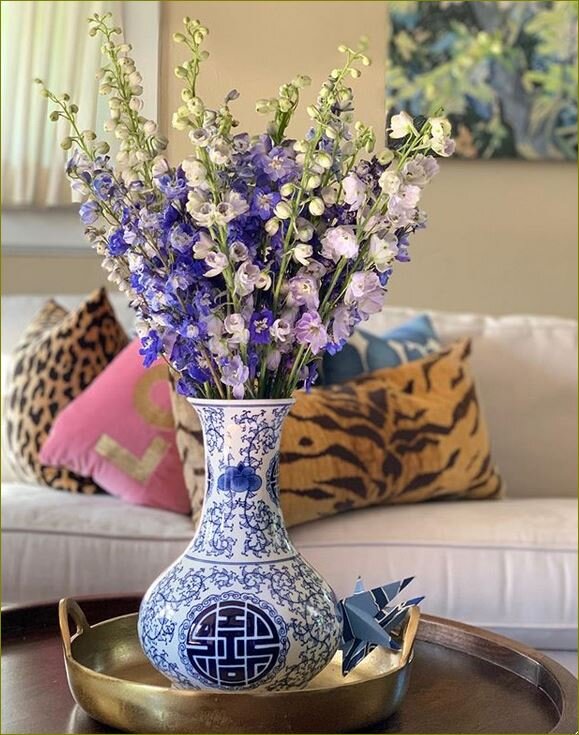
Traditional Casual with a touch of Chinoiserie is the new description of the Chalet!
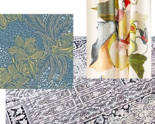
Next week I’ll be sharing the Images that are inspiring my thoughts for new floor coverings!
Til next time!

