Chalet Design
/May 2019
In January I shared a piece Design Shift where I mapped out how I got to our new Crate and Barrel Couch and the evolution of the changes that have taken place in the Chalet decor since last summer. I followed up with Inspirational Images sharing images of spaces and designers who were inspiring me in the direction of my rug search.
Today I’m wrapping up this conversation. If you follow along on IG than some of these changes aren’t new but, let’s dive into the final result anyway…how I got where I am today June 12th, 2019.
September 2018
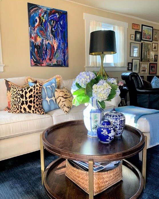
Here’s a bit of the backstory if you’re unfamiliar - So last summer - when no amount of pillow swapping would cure my angst about the decor in the Chalet. I pulled the trigger with my husband’s blessing and ordered a new couch. I felt the taupe theme that was in our livingroom for 10 years had to go.
Here’s what the space looked like last fall.
I ordered the couch and found my round coffee table at Home Sense and I was off to the races my friends!
October 2018
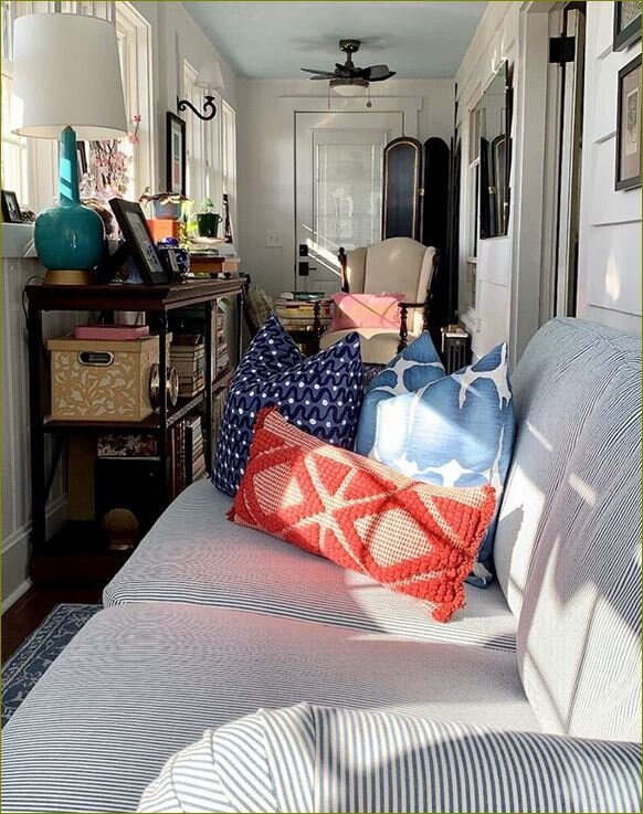
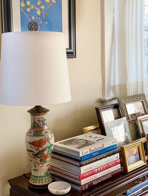
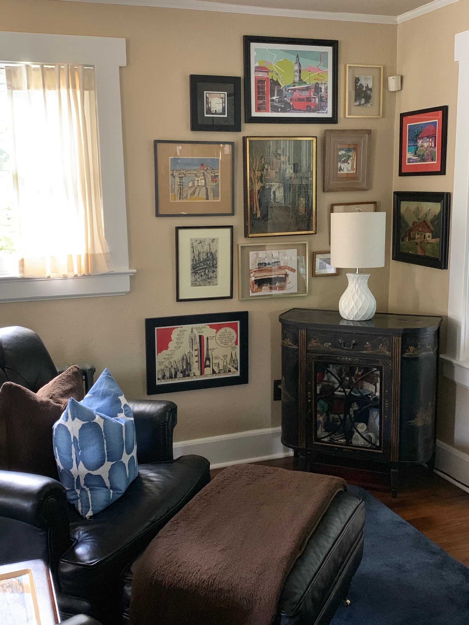
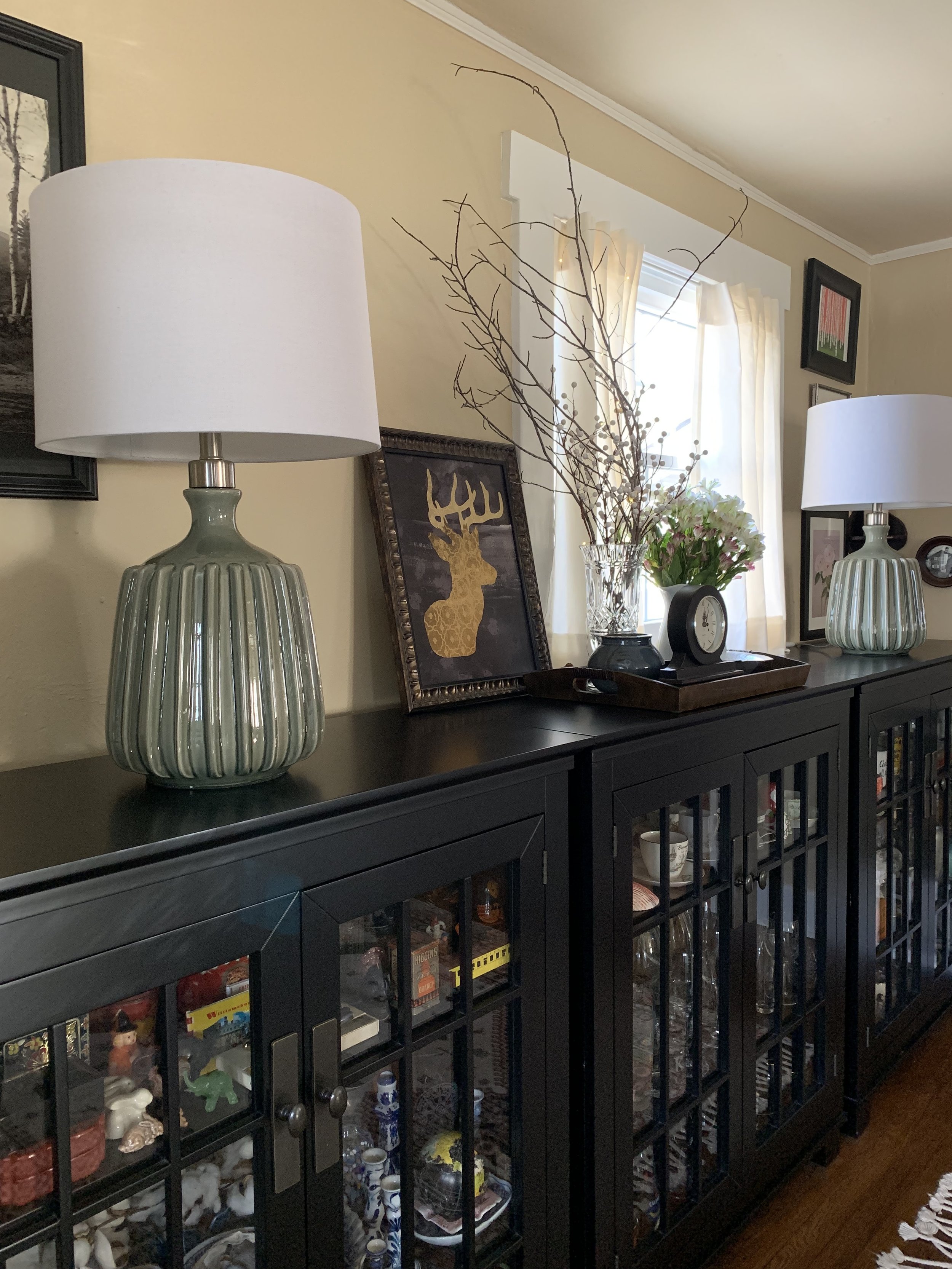
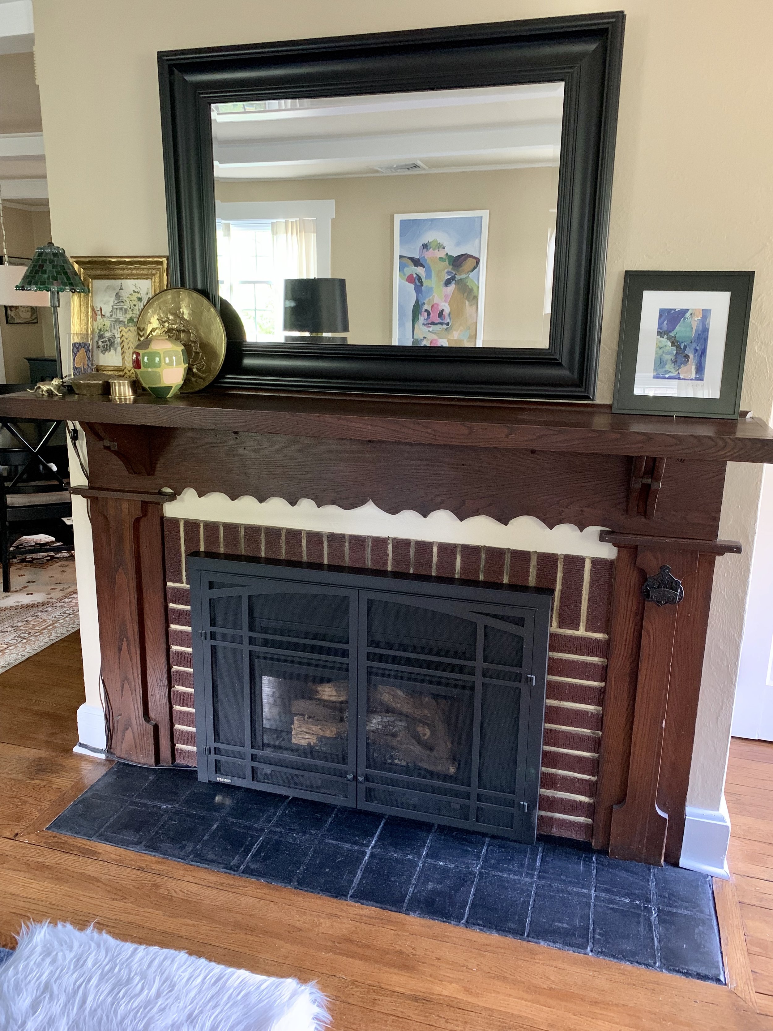
Once I had the coffee table and couch I worked my way around the Chalet refining book piles, editing picture frames and in general making it tighter. Layered is great but, messy and unfocused is not. When I got to lighting - I adding a new drum shade to the vintage Chinese lamp - a new smaller more modern lamp for the black Chinese cabinet and I went mid-century modern with the set of green ceramic for the diningroom - all purchased at Home Sense. I lessened the amount of decor on the mantel - limiting them to one side and focusing on a sole piece of art by Allison Ford on the other. I made pillow covers - you can spy one on the leather chair above. Then we moved some chairs around between the porch and the livingroom.
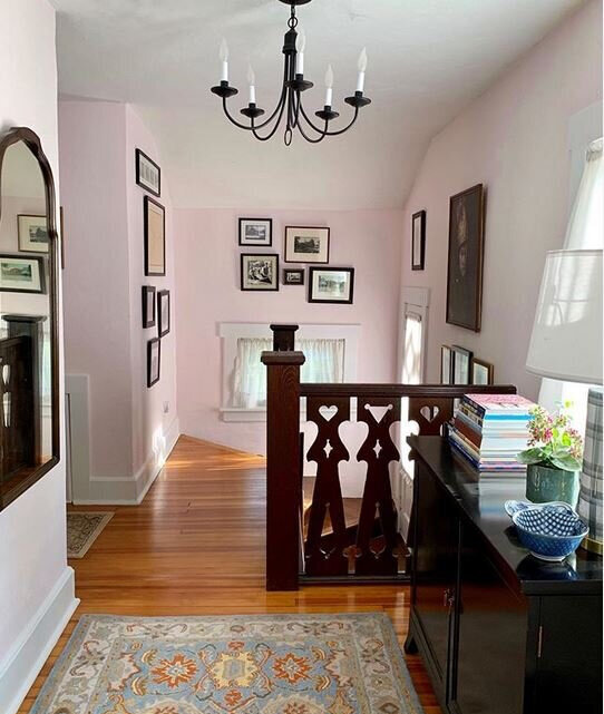
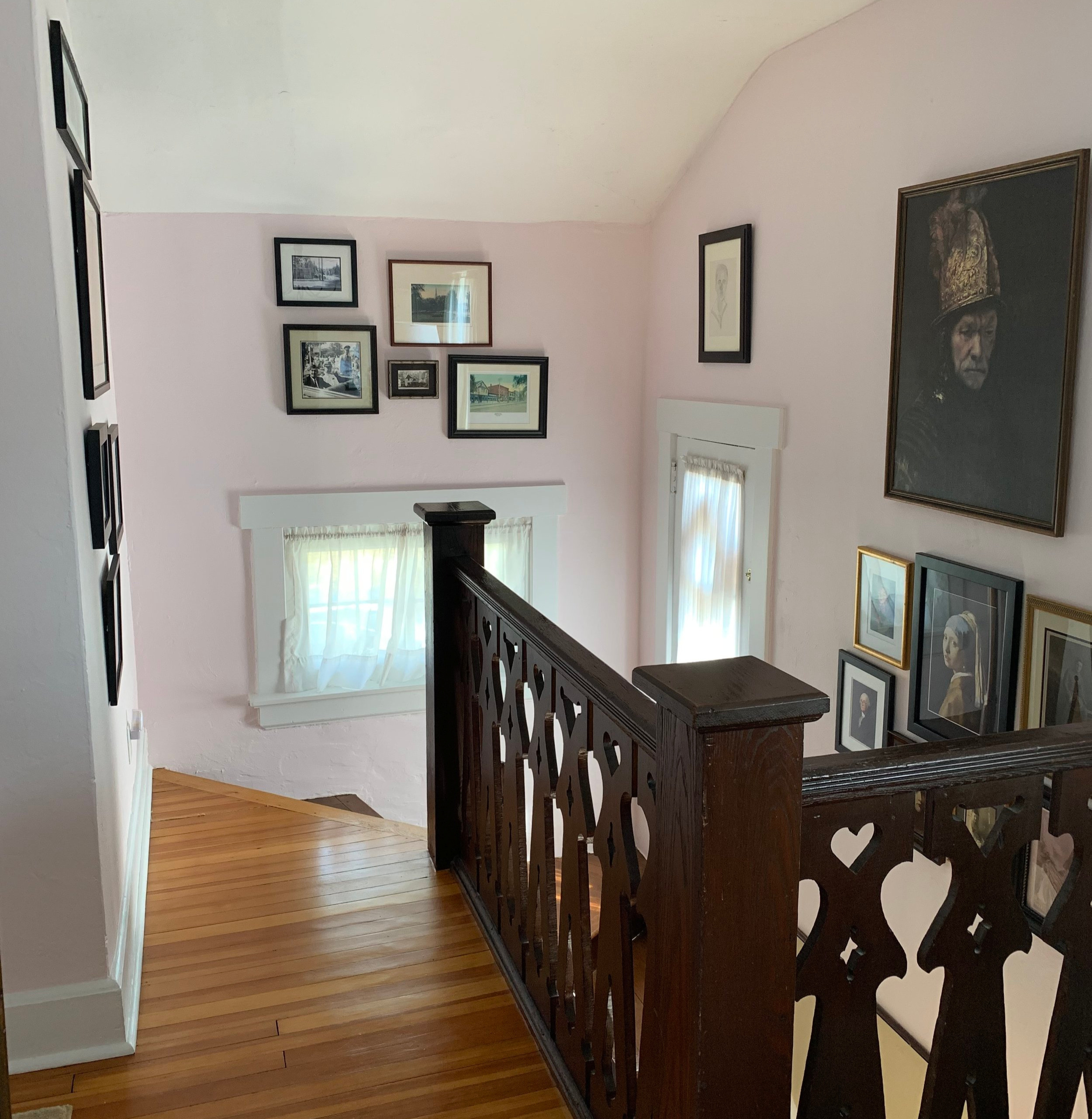
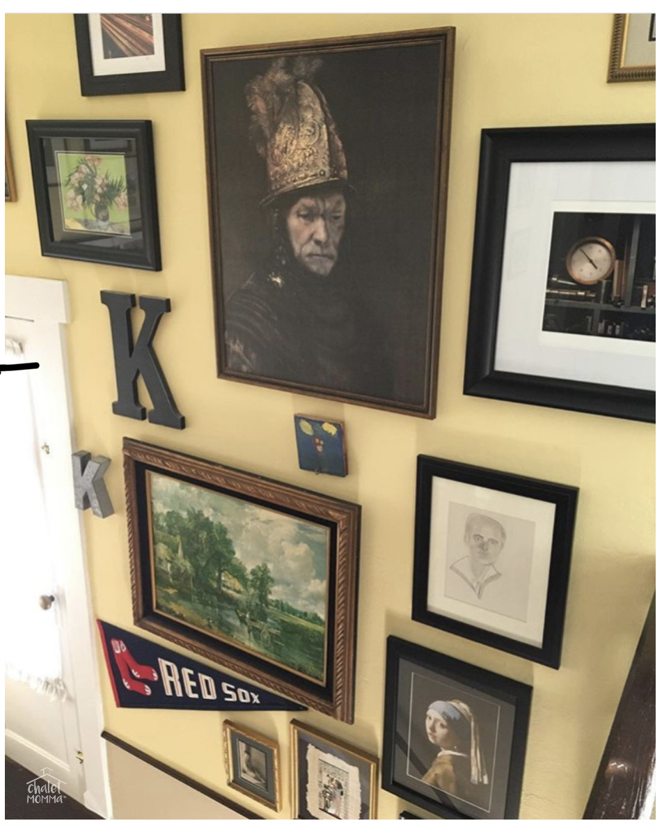
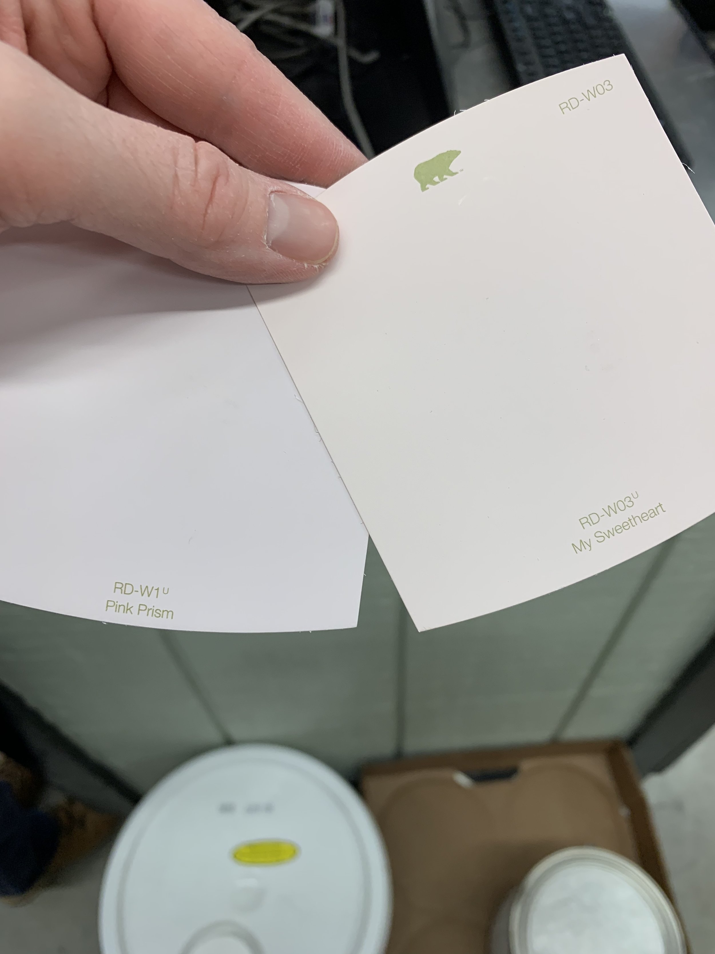
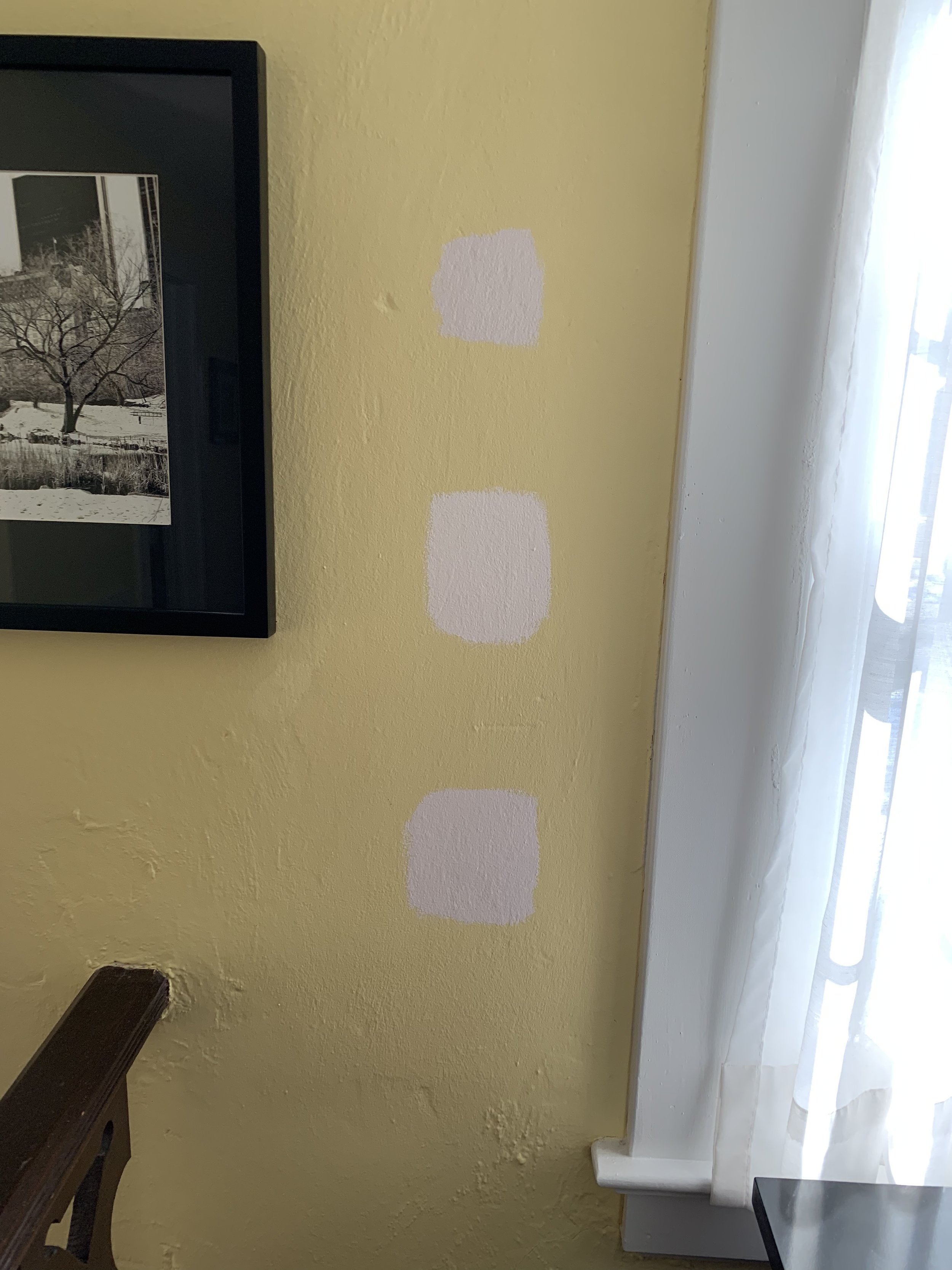
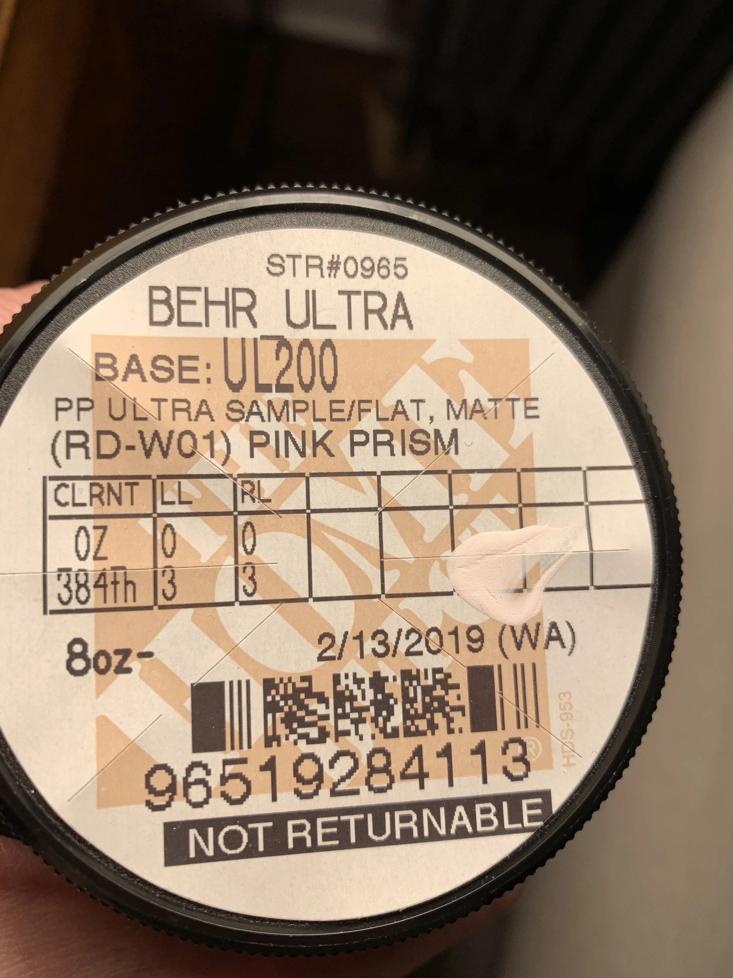
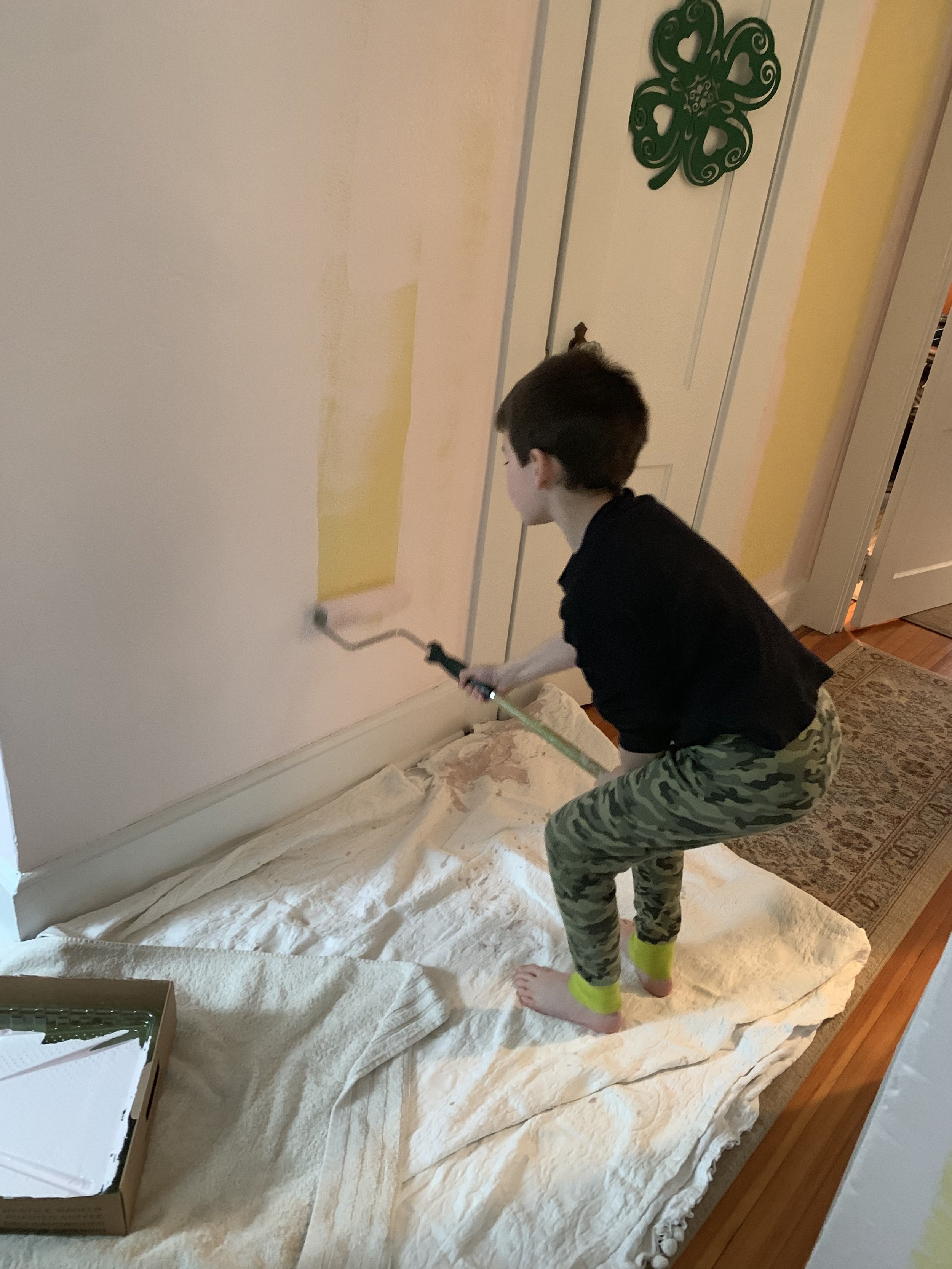
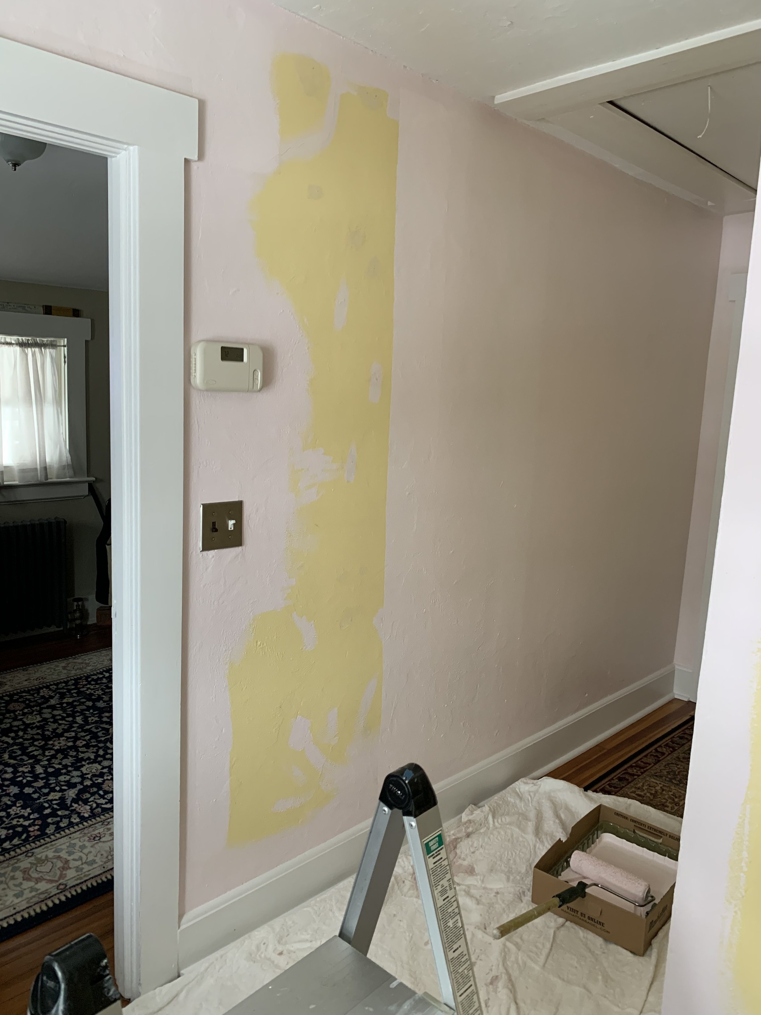
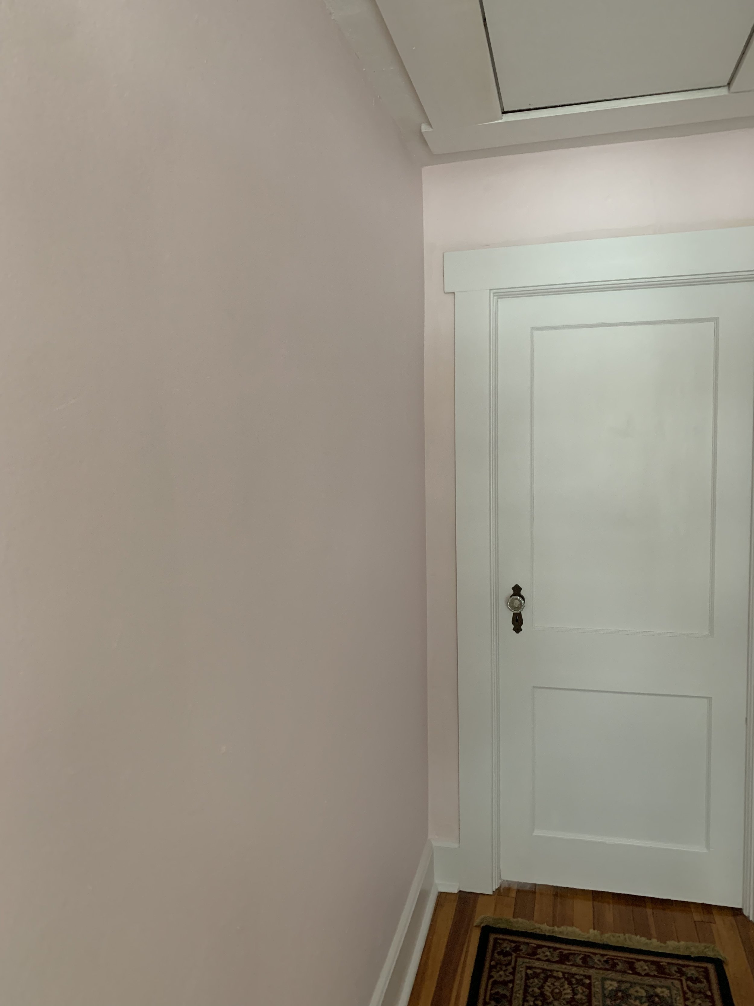
While trying to figure out the rugs - as you read in Artistic Artery - I pulled all the art down and repainted our Hall Behr Paint Pink Prism. Our Bedroom is also Pink - I love pink - to me it’s a neutral. It makes everyone happy who sees it. I also lessened the approach when I rehung the art - taking my time to focus on a portrait gallery - I put some art away.
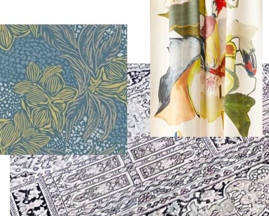
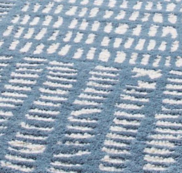
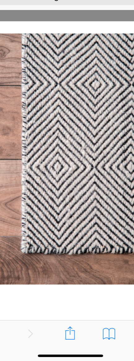
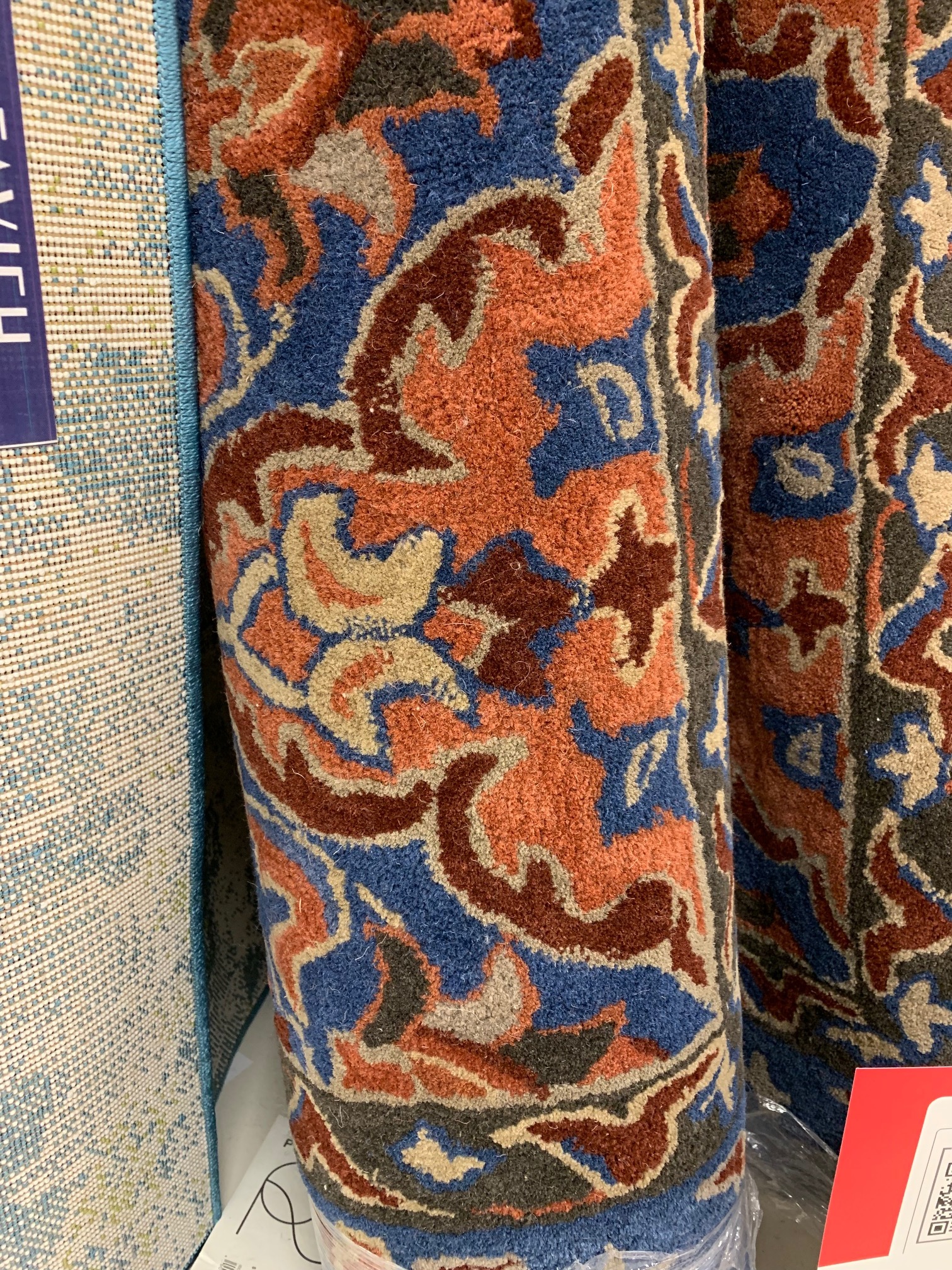
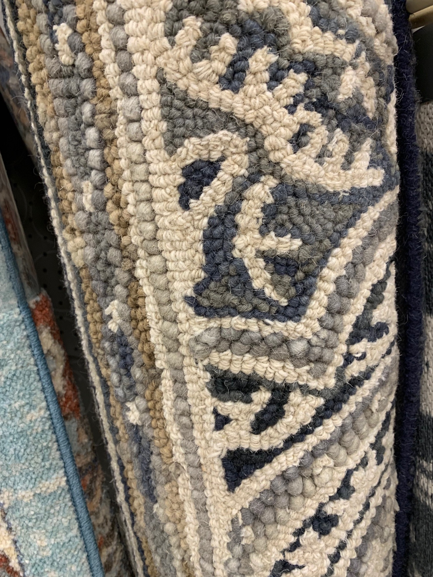
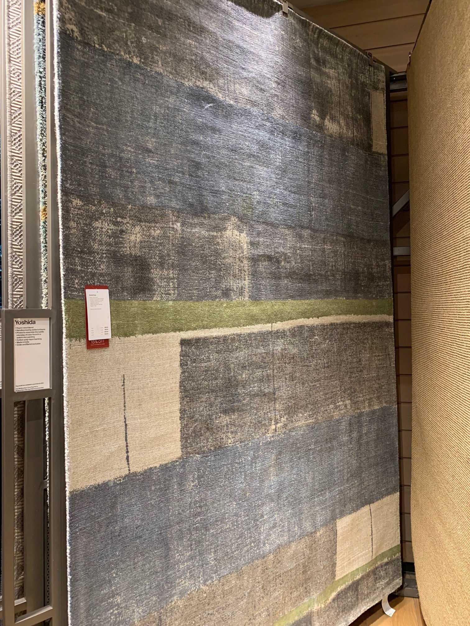
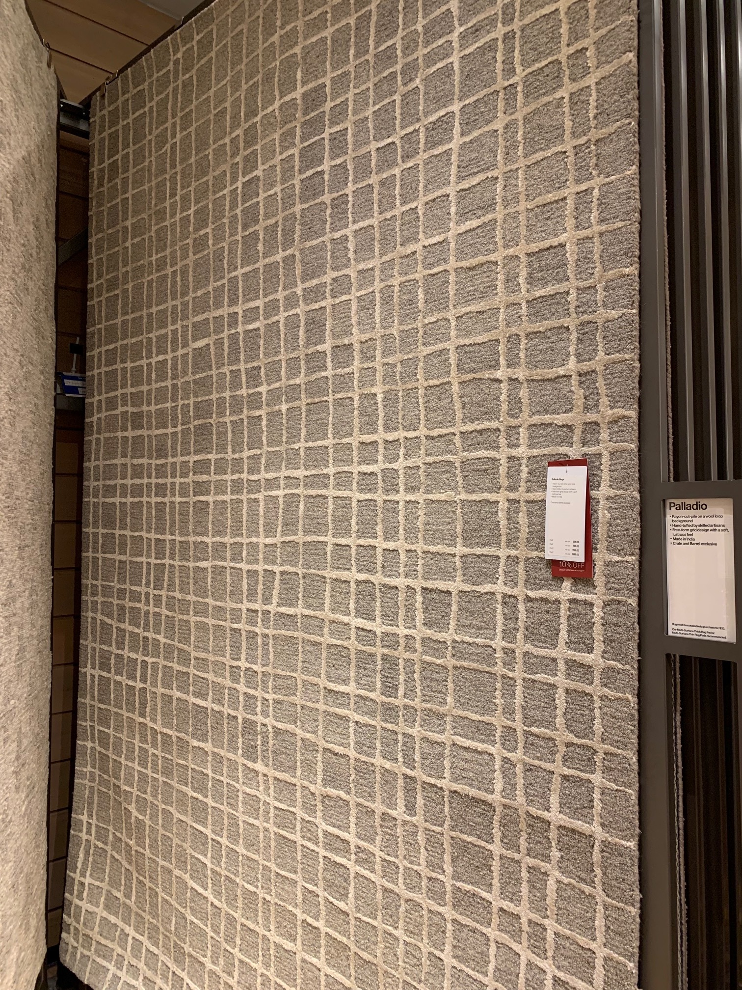
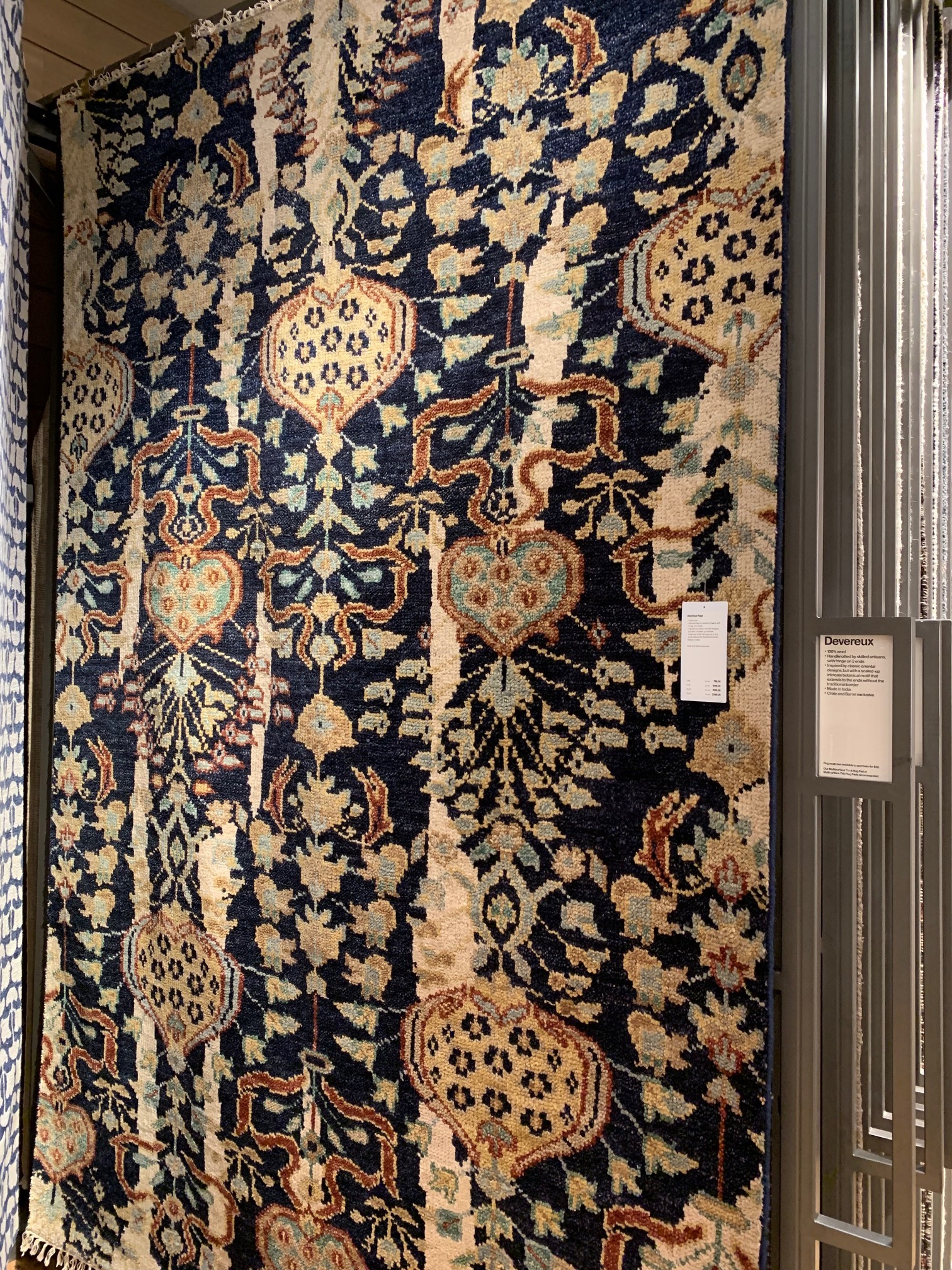
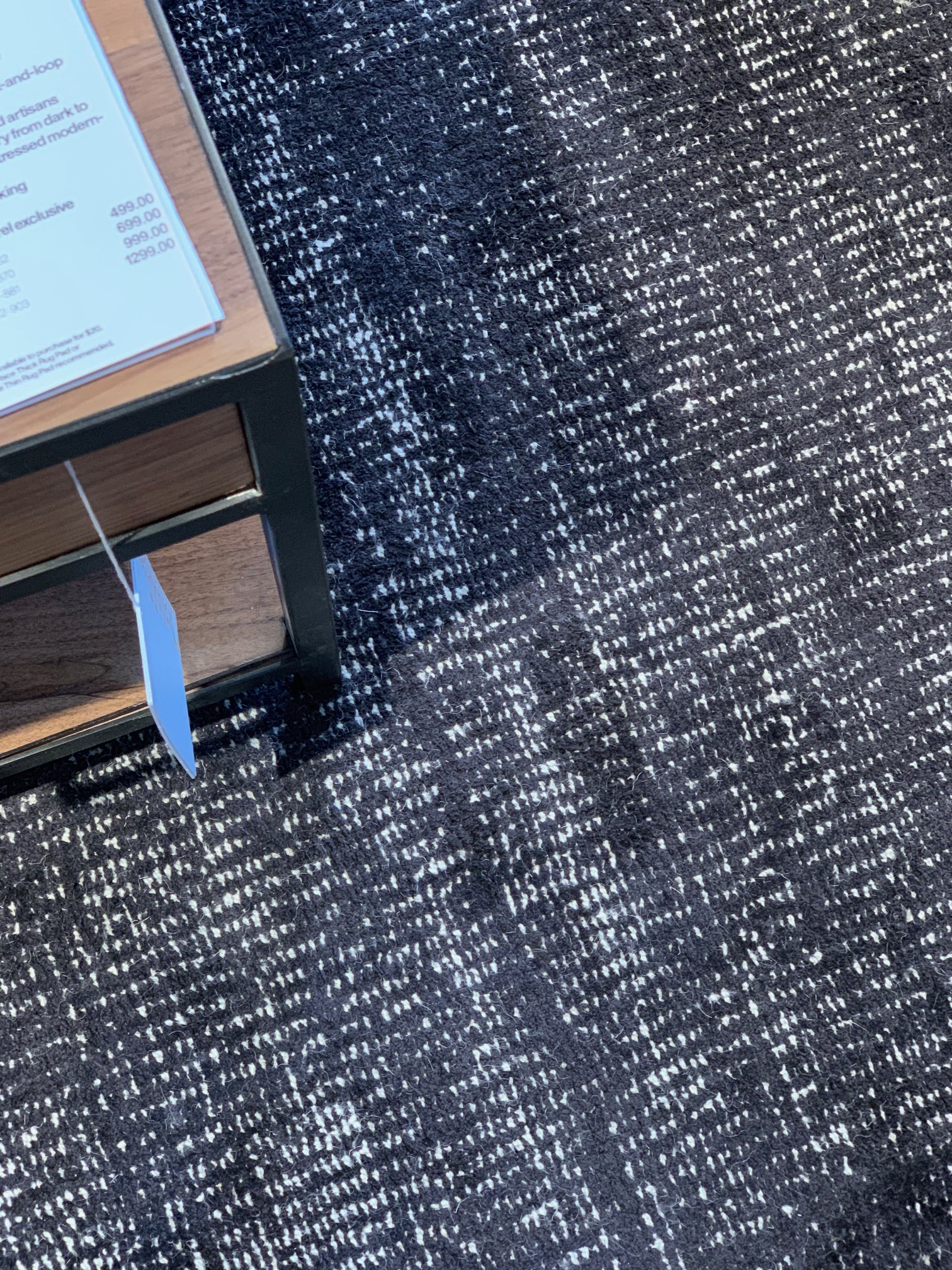
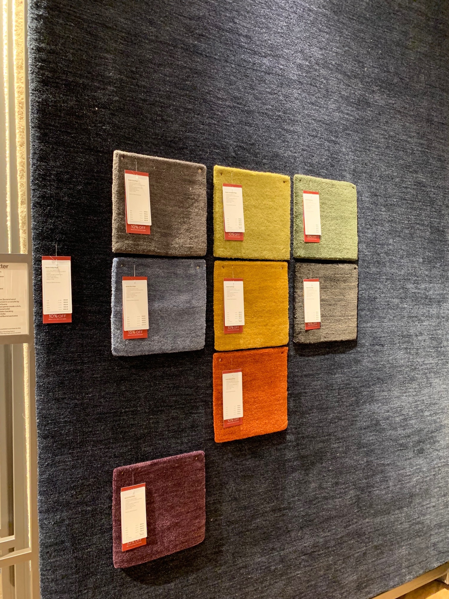
The process of finding new rugs took about 6 months. I looked and looked - I vacillated over the design direction. As is my curse I like so many styles. Our old rugs were Pottery Barn - and to span the challenging length and width of the Chalet livingroom and den area - 10 x 24 - I had previously gone with 3 rugs. The Images above show the progression of the Rug hunt. Top left was a Crate Kids design I tried to order but, it was Sold Out! It still makes me cringe! Then I decided to shift my focus to a layered look ordering the top middle geometric design from Rugs USA - I thought I would layer a rug I have over it - they were delivered all the furniture was moved but, the moment Steven started rolling out the rug I said “Stop it’s bringing on a Vertigo Episode” so back they went and the hunt continued. Finally I ended up at my local Crate and Barrel store (I really am a big fan of this brand -Hello Brand Ambassadorship anyone? my dining table and glass door cabinets in the diningroom are from Crate) there I bought three Baxter Rugs a 5x8, a 8x10 and a 6x9. They are made of New Zealand Wool and have shed little to none. I’m very pleased.
I completely restyled the little spot in the diningroom last month. I love it now! I still needed to change the shade to a modern drum shade - it took a while to find just the right one. Many shades were either too small or too large. I just picked up the pretty patterned number below on Monday at my local At Home store - while I was there working with a client.
June 2019
June 2019
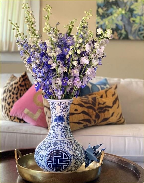
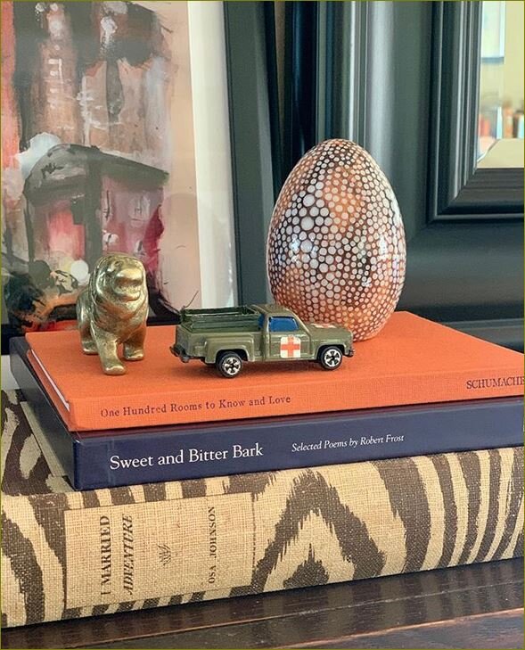
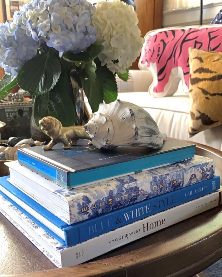
Will I say that I’m done… NO… I still think I may want to add a layering rug under the coffee table to make the room pop more. I would love more pattern; recently I added Bessie to the wall, more books and collections to the Coffee Table and here we are. The design scheme is more streamlined and I’m pleased… I no longer think my style is Cacophony of Crap! I think my style has traditional elements with a bit of Modern, Chinoiserie and Vintage thrown in. I’d label it:
Traditional Mix.
Til next time!

